Innlegg i Dagens Næringsliv 19.01.22
DN publiserte 19. januar 2022 et innlegg skrevet av Victoria Sparrman og Ragnar Nymoen. På grunn av en produksjonsfeil i den medfølgende figuren gjengis innlegget her, med korrekt grafikk: Anslagene for smitteutviklingen kan bli sikrere.
Artikkel i Samfunnsøkonomen nr. 1, 2022
Dynamisk modellering og framskrivning av nye smittede og innlagte med Covid-19 i Norge.
Spredning av Covid-19 Norge i november 2021-april 2022. Prognoser og faktiske tall.
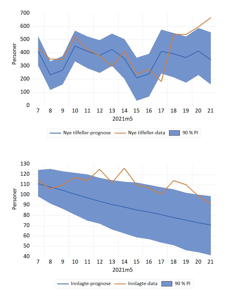
Figurene for innlagte og ny smittede nedenfor er oppdateringer av Figur 3 og 4 i: Dynamisk modellering og framskrivning av nye smittede og innlagte med Covid-19 i Norge som kommer i Samfunnsøkonomen nr. 1 2022. Lenke til fil med data og modell som er brukt i artikkelen.
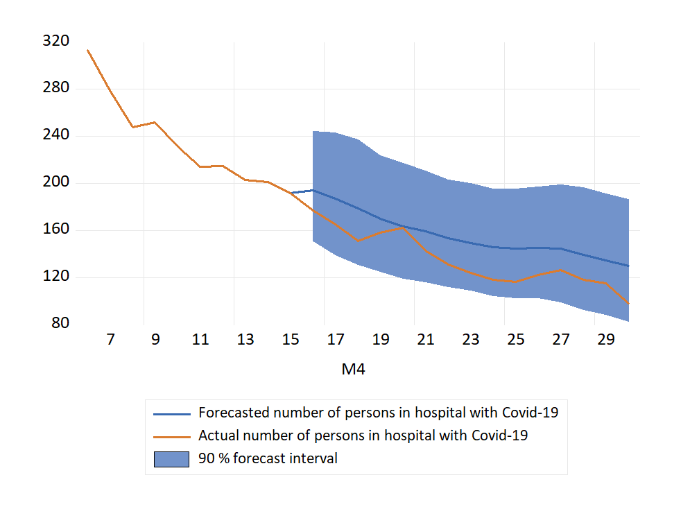
Innlagte på sykehus med påvist Covid-19
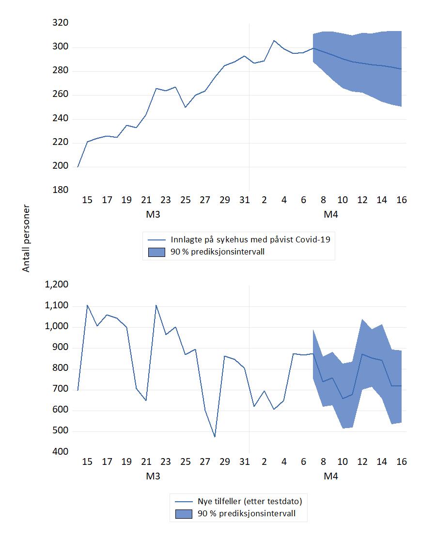
Antall innlagte på norske sykehus nådde en foreløpig topp rett før jul og hadde en fallende tendens i de første påfølgende ukene. I CovidMod forklares dette ved økende vaksinasjonsgrad og den lavere sykeligheten som kjennetegner omicronvarianten. I andre halvdel januar var antall innlagte forholdsvis stabilt igjen. FHIs prognoser fra 12. januar tilsa helt annen utvikling, med en bratt stigning i uke 4 og 615 personer ved utgangen av januar.
Den (etter norske forhold) store økningen i antallet innlagte kom imidlertid i februar, i forbindelse med omicron varianten og gjenåpning av samfunnet.
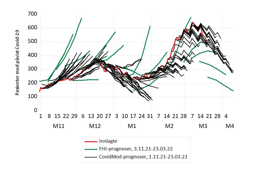
Figur 1 Prognoser og faktiske tall for pasienter innlagt med påvist Covid-19, november 2021-mars 2022. Prognosene er fra CovidMod (svarte grafer) og FHIs ukentlige modelleringsrapport: Situational awarensess and forecasting for Norway (grønne grafer). Kilde: Normetrics, FHI
Dessverre har Helsedirektoratet bestemt seg for å avslutte statistikken for antallet innlagte med Covid-19. Tallet for 22. mars (467 innlagte) blir det siste publiserte. Dermed blir det ikke mulig å beregne og evaluere prognosefeil for innlagte for resten av mars og for april.
Nye smittede
Antallet nye registrerte økte markert i løpet av de to første ukene i januar. Prognosene fra CovidMod framskrev denne trenden (men med stor variasjon i de daglige tallene). I modellen forklares utviklingen av den høye smittsomheten av omicron, og av lettelser i de nasjonale restriksjonene. Den foreløpig siste prognosen fra FHI er fra publikasjonen «Situational awareness and forecasting for Norway» datert 5. januar. Den prognosebanen viste en synkende utvikling som ikke samsvarte med den faktiske utviklingen i smittetallene.
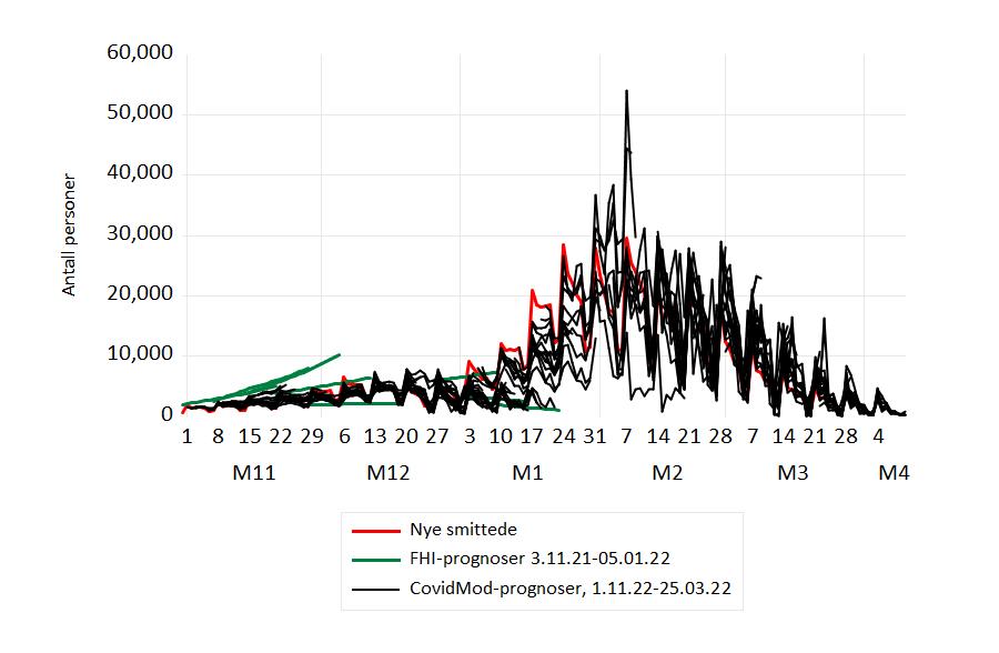
Figur 2 Prognoser og faktiske tall for nye smittede, november 2021-april 2022. 26. januar markerte et skifte i testregime: En positiv «selvtest» ble ikke lenger fulgt av en obligatorisk PCR-test . Dette påvirket antall registrert smittede (brudd i serien). Kilde: Normetrics, FHI.
Bruddet i tidsserien 26. januar gjorde at det for en periode ble vanskeligere å framskrive nye smittede særlig nøyaktig. Men bruddet ser ikke ut til å ha gjort det «varig vanskeligere» å gjøre framskrivninger dersom man er interessert i det, som kurvene for framskrivninger og faktiske tall for februar og mars viser.
26. mars 2022
Evaluering av prognose fra 2. juni 2021
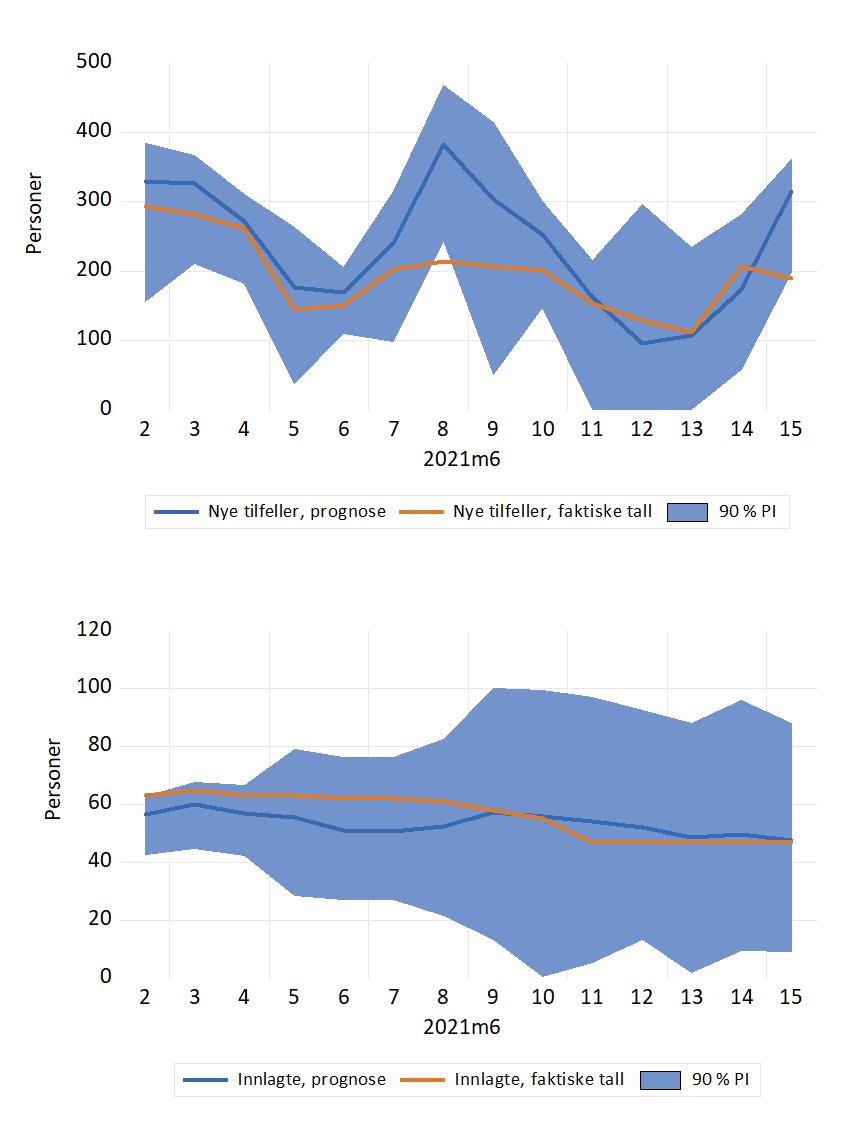
For dagene 2.-7. juni ble antall nye smittede bare moderat overpredikert av den økonometriske prognosemodellen. For de neste dagene, 8. og 9. juni, ble antallet nye tilfeller ganske kraftig overpredikert. Prognosen for 8. juni ble (per definisjon) en prognosefiasko, siden det faktiske tallet havnet utenfor prediksjonsintervallet («90 % PI» i figuren). Det er ingen flere slike signifikante prognosefeil (med et mulig unntak for 15. juni, men det faktiske tallet kan ennå bli noe oppjustert).
Prognosen for antall innlagte på sykehus med Covid-19 ligger noe høyt i starten av perioden, men treffer de faktiske tallene bedre etter hvert.
Til sammenligning kan vi notere at FHIs prognose fra 2. juni var 460 nye tilfeller for 6. juni. Faktisk tall for 6. juni ble 150. 13. juni var det 111 nye smittede. Vår økonometriske prognose var 108, mens FHI prognosen var 621 nye smittede.
FHIs prognoser for antall innlagte lå også for høyt (i 2. juni rapporten): 115 innlagte 6. juni, og 116 innlagte 13. juni. Faktiske tall ble 62 og 47.
Notat om metode og modellbeskrivelse
Postet 14. juni 2021, oppdatert 18. juni 2021
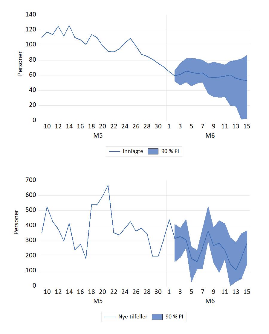
Covid-19 framskrivning, 2. juni oppdatering.
Postet 3 juni 2021
Evaluering av prognose fra 7. mai 2021
Notat om metode og modellbeskrivelse
Postet 3. juni 2021
Covid-19 framskrivning, 7. mai oppdatering.
Den siste prognosen viser fortsatt fall i antall innlagte. Grafen som viser prognosen for daglig antall nye tilfeller viser tegn til en viss utflating. Usikkerhetsfanen viser at en bør ikke være overrasket dersom der skjer en økning i smitten utover i mai. Men et smittenivå som det vi hadde i midten av april ligger likevel utenfor det skisserte prediksjonsintervallet.
Figur 2 viser prognosene fra 15. April sammen med faktiske tall fra 15. april til 39. april 2021.
Notat om metode og modellbeskrivelse
Postet 7. mai 2021.
Covid-19 framskrivning (7 april oppdatering)
Denne framskrivningen av nye tilfeller framstår som signifikant forskjellig fra prognosen til FHI fra 31. mars 2021, som gir ca 1500 nye tilfeller (daglig insidens) 11. april 2021.
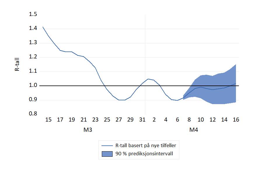
Et tidsavhenging R-tall kan beregnes fra tidsserien for nye smittetilfeller. Dette er en vanlig metode i utlandet. Grafen til et slikt R-tall er vist i figuren nedenfor, sammen med en framskrivingen for perioden 7.-15. april.
Notat om metode og modellbeskrivelse.
Postet: 7. april 2021
Forecasting Covid-19 in Norway (the third wave)
On this page, forecast for the first outbreak (or wave) of Covid-19 was published and evaluated (with graphs showing actuals as they became published). However already in early May 2020 the number of new cases and patients in hospitals with Covid-19 had become so low that there was no point in doing any more forecasting before a new outbreak occurred (see the post dated 18 May 2020 below).
However, in the middle of March 2021, Norway was well into her third wave. The number of new daily cases registered had become higher than a year ago (in large part due to more testing). An important new development during the winter of 2021 has been the spread of new “versions” of the virus (mutants). The number of people hospitalized has increased, but is still lower than the peak in the winter of 2020.
It is therefore of interest to re-start regular forecasting of the spread of Covid-19 in Norway. The figure shows new daily cases (upper graph) and the number of Covid -19 patients in Norwegian hospitals. The forecast period is 19 March 26 March (a seven day forecast horizon). The forecasts are shown with approximate 95 % forecast fans.

Note: The number of cases are recorded by the specimen collection date. There are 1-2 days delay between diagnosis and registration in the Norwegian Surveillance System for Communicable Diseases (MSIS). The number of cases is updated retroactively when new notifications arrive. This is an imporant difference from the much cited figures in the VG newspaper.
Posted 19 March 2021
GDP recovery after the Covid pandemic: the case of Norway
When will the economy be back at the pre-Covid level of income generation? Forecasting institutions around the world now attempted to answer that question, as we begin to see the end of the pandemic.
In its Monetary Policy Report (MPR) from November, Bank of England presented projections showing that GDP in the UK could be at the level of 2019(4) two years later, in 2021(4). However, there is considerable uncertainty around the monetary policy committee’s central projections as the Bank’s fan charts for GDP shows. A lot the uncertainty is generic. However, in this case there is also the possibility that the pandemic may lead to new lockdowns during the winter of 2021. In Britain’s case, there is also the consequences of Brexit to consider.
Like all countries, Norway has seen a drop in GDP during the pandemic. Figure 1 shows one projection of Mainland Norway GDP (i.e., without extraction and transport of raw oil and of natural gas). In the figure, the line graph to the left of the vertical line shows the actual time series for quarterly GDP (in mill. NOK, fixed prices). The time series has been seasonally corrected. To the right of the vertical line, the graph represents the central projection of the macro econometric model NAM (again after seasonal adjustment). The model’s central projection (also called point-forecast) is conditional on what can be broadly referred to as economic circumstances as of late November 2020. Among these are the measurements of the economy for 2020(3) (and earlier), and the projections of the model’s exogenous variables over the forecast period.
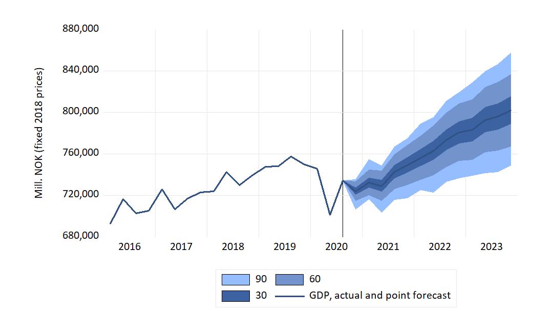
The confidence area bands reflect two types of generic uncertainty: The variances of the random-error terms that separate the modelled variables from their explanation, and the estimated coefficient uncertainty of those explanations. The interpretation of the dark (central) band is that if we imagine 100 observations of GDP over the forecast period, the actual GDP would lie within the darkest band on only 30 of those occasions. The bands labelled “60” and “90” have similar interpretations.
The figure’s central tendency therefore indicates that GDP can be expected to be back at the pre-pandemic high level in 2021(4). The central projection shows that the GDP level of 2019(4) might be reached somewhat earlier in 2021. The projected length of the recovery period is in line with Bank of England’s forecast for the UK economy mentioned above.
Even though a fan chart like the one in Figure 1 may appear to be wide at first sight, the hard reality is that fan charts (and other visualizations of forecast uncertainty) usually underestimate the uncertainty about the future. This is proven by the high frequency of failures (e.g., actual GDP outside the 90-band) experienced by forecasters of the macro economy. A main explanation of forecast failures are structural breaks in the economy in the forecasts period. Until such breaks can be forecasted, failures will continue to haunt macroeconomic projections. In current practice, they can only be mitigated by updating of the forecast, correcting for any early signs of breaks. As noted above it is easy to think of the development of the pandemic itself as a source of structural break in the near future.
The economy have started on the path to recovery. As vaccine start to be rolled-out, hopes are the climb can be steeper than in the central projection. But it may yet be broken by set-backs, and not be a smooth glide path.
Posted 9 December 2020
Housing prices during the pandemic
In several countries, commentators have expressed surprise about the resilience of the housing market so far during the pandemic. Norway is no exception. The implosion scenario, which was a possibility at the start of the pandemic, did not occur. Instead, the nominal house price has increased at the national level.
One perspective on this issue can be obtained by simulating NAM, an empirical macro econometric model of the Norwegian economy. The figure shows the actual price development from 2016q1 to 2020q3, together with the simulated housing price index for 2020q1-2020q4. The fan represents 90 % confidence intervals for the simulated values.
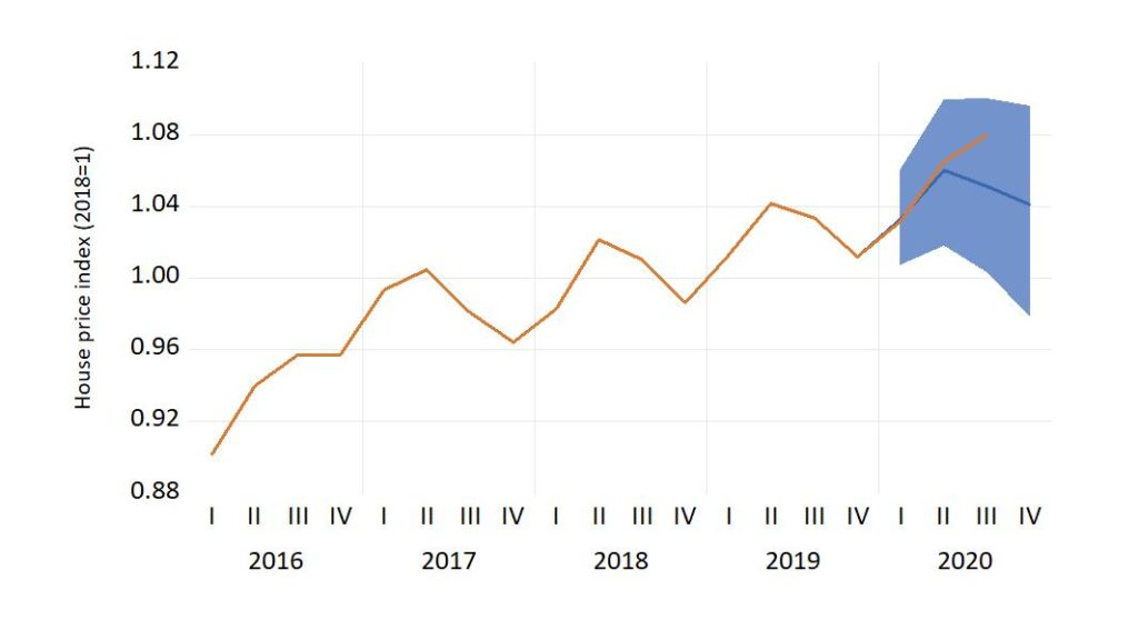
The figure confirms that the performance of the housing price has been strong, but not surprisingly strong, so far in the pandemic. However, there is a potential for bigger surprises. In the short-term maybe in the form of higher prices. In the medium term perspective, the signs are more difficult to read. Rising household debt, from a high level, is still the thin end of the wedge.
Link to a note written in Norwegian
Posted 26 Nov 2020
Sudden changes in economic activity, with and without lock-down
This comment, in the Norwegian journal Samfunnsøkonomen, discusses how a particular form of imbalance in capital markets (related to overdermination of the interest rate) can harbour quick and unexpected changes in macro economic actvity, with and without lock-down.
Mulighetene for brå endring i den økonomiske aktivitet, med og uten
«lock-down»
Posted 15 September 2020
Emerging labour market changes
New unemployment data from Statistics Norway (23 July 2020) showed that in the second quarter of 2020 the unemployment rate had increased to 4.6 per cent, up 1.2 percentage points from the second quarter of 2019. These numbers are from the labour force survey, which needs to be kept apart from the numbers for registered unemployment compiled by NAV.
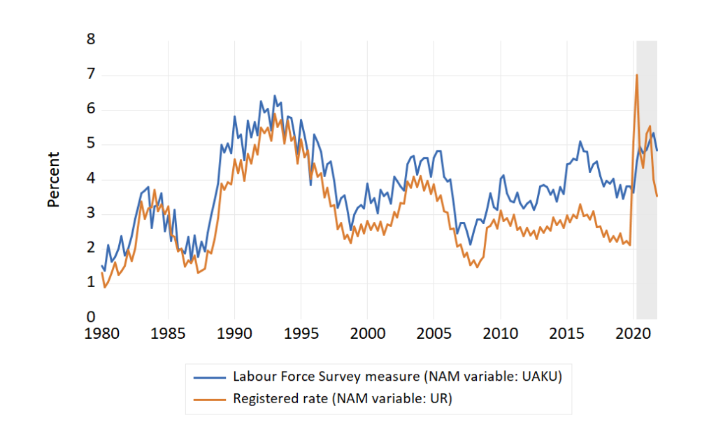
As the figure shows, the usual pattern has been that the labour force measure of the unemployment rate is higher than the registered rate (and the gap has been consistently wider after 2010 than before). But this changed in the first quarter of 2020, when the registered rate rose to 5.1 percent while the Labour force survey measure was almost unchanged at 3.6 percent. The main reason for the change was that the many temporary laid-off workers did not count as unemployed in the labour force survey.
In the latest NAM forecast (shaded part of the figure) gave point forecasts of 4.5 % (labour force survey) and 7.0 % (registered rate) in 2019q2. However, over the next quarters in the forecast period, the rates are converging with signs a return of the normal pattern in the second half of 2021. The interpretation of this picture is mixed: Many temporary laid off return to their jobs, at least on part time, allowing the registered rate to drop rapidly. However, at the same time many worker become permanently redundant and this may accounts for the increase in the forecasted labour force survey rate of unemployment.
As reported by Statistics Norway, there are indications in the labour force survey data that the labour market flows (dynamics in and out of employment etc) have been affected in a way that is consistent with a higher level of unemployment in the future, if the changed dynamics persists.
Posted 28 July 2020
NAM and institutional forecasts for the Norwegian economy-summer 2020
In June, the two leading forecasting institutions, Statistics Norway (SSB) and Norges Bank (NB) published new forecasts for the macro economy. Both institutions expect 2021 Mainland Norway GDP to be a little above the 2019 level in 2021. The number of person employed is also expected to get back to positive growth in 2021.
As the note on mid-year forecasts shows, a main difference between the two institutional forecasts and the NAM based forecast (for 2020Q2-2023q4) is that the NAM forecast for employment in 2021 is bleaker than in the two institutional forecasts.
Posted on 10 July 2020
5-16 May Covid-19 forecast evauation
The number of patients in hospitals came out close to the forecast, as shown in the figure.
However, the number of new daily cases is now low and stable. At the time of writing Norwegian Covid-19 epidemic is pratically over, and there is little point in forecasting it. That is, until another outbreak occurs, which is a real possibility when travel accross border opens up again.
18 May 2020
5-16 May Covid-19 forecasts
20 April marked the start of a stage-wise dismantling of the Norwegian Covid-19 lockdown. For example, kindergartens re-opened on 20 April, and primary schools on 27 April.
A shown in the evaluation of the 16-30 April forecast (below), there were no sign of any surprising increase in Covid-19 in the end-of-April numbers. That may have been too soon, though.
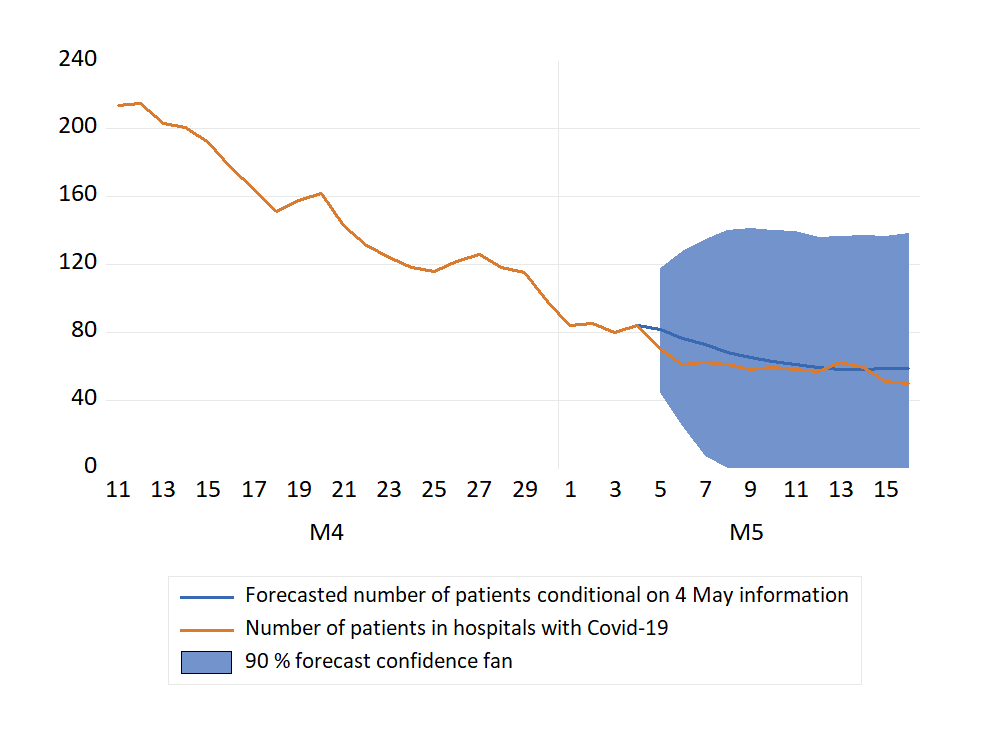
IIn te figure below, forecasts for 5-16 May (conditional on 4 May information) are shown. The picture is a continuation of the modest increase in accumulated cases that we have seen in the first days of May. Together with a flattening of the curve that shows a decline in the number of patients in hospitals with Covid-19.
Evaluation of 16-30 April Covid-19 forecasts.
The numbers from the second half of April are now available, and the extrapolations for that period can be evaluated.
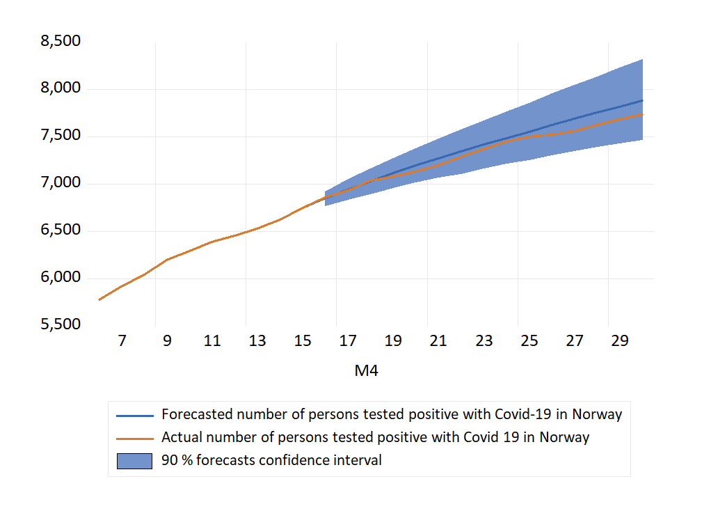
Figure 1 shows that over the period as a whole, the extrapolated series overestimated the number of cases in Norway in April. Hence, the average forecast error (actual minus forecast) is negative. However, considering the forecast confidence intervals, there are no cases of forecast failure (the actual numbers are always inside the forecast intervals).
Although not strictly monotonous, there is a tendency of increasing overestimation as the length of the forecast horizon is increased (away from the origin of the forecast). By 21 April, the error had grown to 73 persons. For the following days the errors became smaller (34 for 24 April for example). However, for the last days of the month, the errors increased again, as the graphs in Figure 1 shows. For 30 April, the actual number of Covid-19 positives was 138 fewer than the forecasted number (made a half a month earlier) .
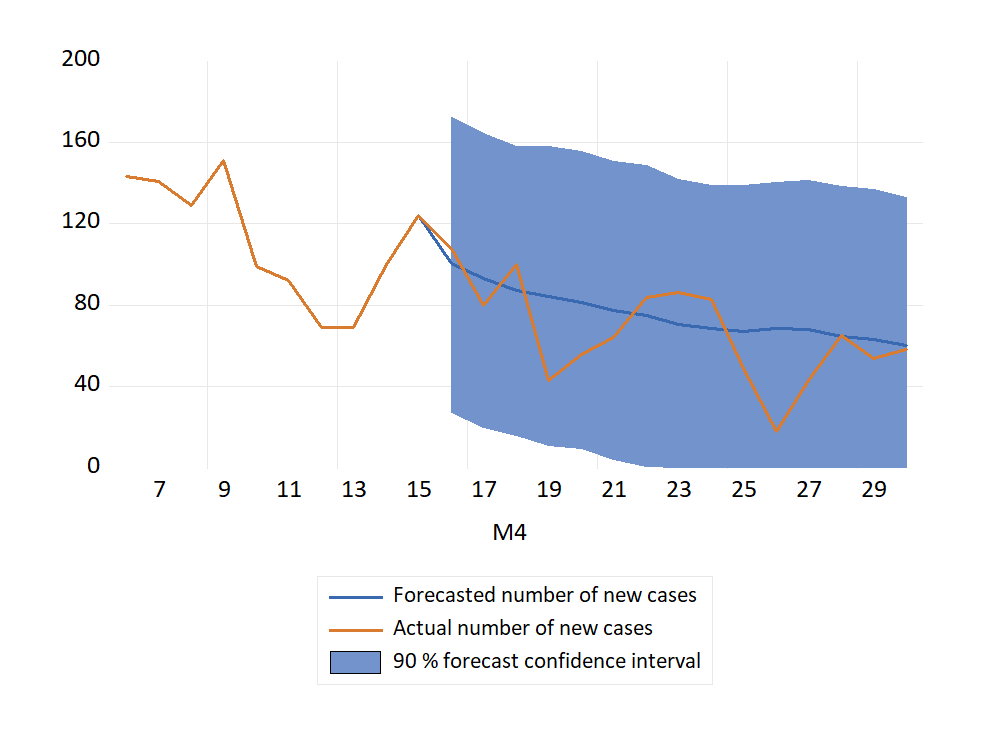
Figure 2 show the extrapolated number of new cases, together with the actual numbers for the forecast period. Since the number in Figure 1 is the accumulated number of new cases, it sheds light on the tendency of over-prediction seen in that graph.
In Figure 2, the forecast errors are small at the start of the period, and with positive and negative signs. Later the errors becomes larger, and in particular there is notable overprediction on 19 and 26 April (which were both Sundays).
The last extrapolation was for the numbers in hospital with Covid-19. Figure 3 shows that number of patients was reduced faster than indicated by the extrapolations. At the end of the month there were 31 fewer patients than forecasted.
Posted 1 May 2020. Added May 4 2020: Link to pdf in Norwegian
Covid-19 extrapolations: 16-30 April 2020
Forecasts of the number of persons who have affected the disease in Norway can be made by different methods. These forecasts are extrapolations based on methods used in macroeconometric time series modelling.
We can only forecast what is measured, and we forecast the time series of registered cases tested positive, as published in the VG newspaper. A second source of information is the known interventions in the series. An early intervention was the return of ski tourists who had caught the bug in Austrian and Italian Tyrol. A second intervention was the Norwegian version of the Covid19 lockdown which started on 13 March 2020. The first easing of these measures will begin on Monday 20 April.
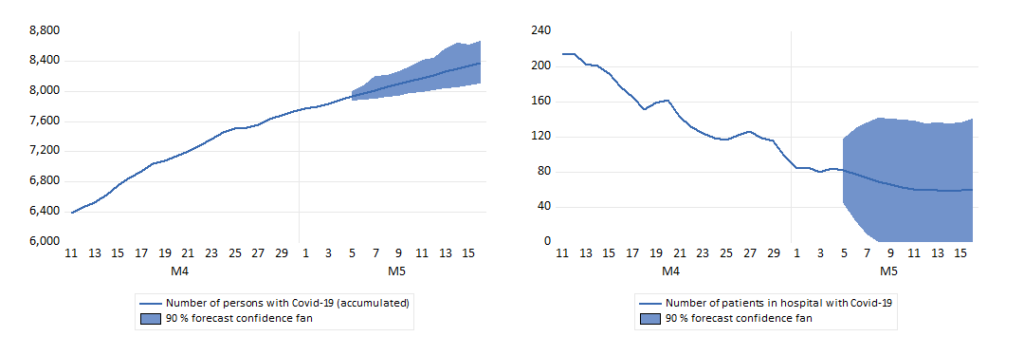
The figures show the number of infected persons (left), the number of Covid1-9 patients in hospital (centre) and new positives (right), with extrapolations for 16-30 April. The shaded areas indicate forecast uncertainty bands (90 percent).
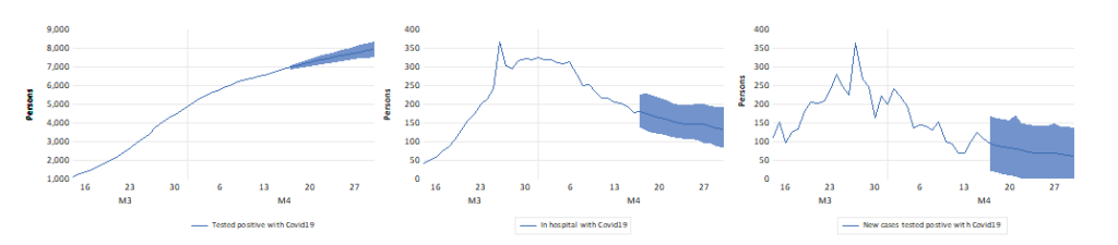
Starting 20 April kindergartens will be open again, and the youngest school children will return to school on 27 April. Some businesses will re-open during the forecast period. More week-end travel is expected to take place during the last weeks of April. The forecasts can be interpreted as conditional on no effect of this opening-up on the spread of Covid19. This is may turn out to be too optimistic, which makes it relevant to update the forecasts quite frequently during the opening-up period. Such updates will soon reveal whether the forecasts begin to under-predict.
Posted 16 April 2020
Unemployment during the ongoing Covid 19 crisis, and after
During the second week of the strict measures taken by the Norwegian government to fight the Covid 19 virus, the share of corona (diagnosed and suspected) work absence declined markedly (green line in the figure below, scale on the left axis).
The rate of registered unemployment (blue line, right axis) continued to increase dramatically to approximately ten percent of the workforce. The phenomenon of collective lay-offs is the main cause of the increase in unemployment, as the red line graph shows.
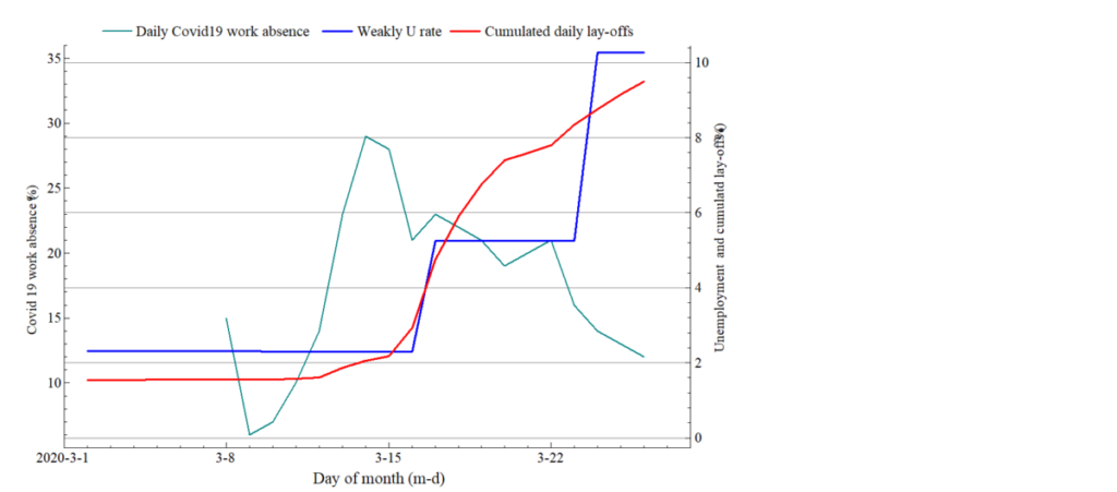
Presently, the share of unemployed who have registered after bankruptcies or permanent downsizing is therefore extremely high. In this lies a potential for a sharp reduction in registered unemployment later in the spring (and a more slow increase in the Labour Force Survey Measure of unemployment).
However, the quarterly data for Q2 for 2020 is likely to show much higher unemployment rate than the pre Covid-19 level that we saw until the third week of March. If, for example the number of registered unemployed should come down to 200K, 120K and 100K in April, May and June (monthly averages), the number of unemployed for Q2 would still be 130 thousand, two times the Q1 number.
One thing that is likely to reduce the number of registered unemployed is that the government will increase labour market program. However, to make that policy practical, the lock-down of the economy must be lifted, and that can at the earliest happen after Easter. However, during the spring registered unemployment plus programs («total unemployment’’) will be an important number to follow, as well as the Labour Force Survey which we refer to be the (Norwegian) acronym AKU.
Both the registered unemployment rate, UR, and the labour force survey percentage, UAKU, are endogenous variables in Norwegian Aggregate Model (NAM). Figure 2 shows forecasts for the two measures of the unemployment rate for the three first quarters of 2020, conditional on the lay-offs seen in March, as well as on some other dimensions of the crisis, i.e., contraction of private domestic demand, plummeting international trade.
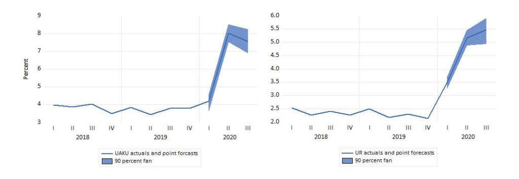
According to these projections, UAKU is forecasted to rise sharply from Q1 to Q2, to a level comparable to the Banking crisis in the early 1990s. Note that unlike the registered rate (right graph), the labour force survey measure (UAKU) increases very little from 2019Q4 to 2020Q1 . The explanation is that the temporary laid-off are not counted as unemployed in the Labour force survey. Hence, in a fortunate scenario where almost all laid-off wage earners return to their jobs in April and June, the increase in UAKU can become much smaller than in this forecast, where the scenario is a severe recession where many workers become permanently laid-off in April and May.
Posted on 30. March 2019. Link to pdf version.
Earlier posts:
International economic crisis as well as measures taken to fight-off Covid 19 takes its toll on Norwegian jobs
The number of lay-offs per day is increasing in a way hitherto unseen in Norway. New statistics from NAV imply that the number of workers who applied for unemployment benefits on Tuesday 17 March amounted to more than 2 percent of the workforce. The total number of new UB applicants was 63680. Most of these (59930) were collective temporary lay-offs, see graph.
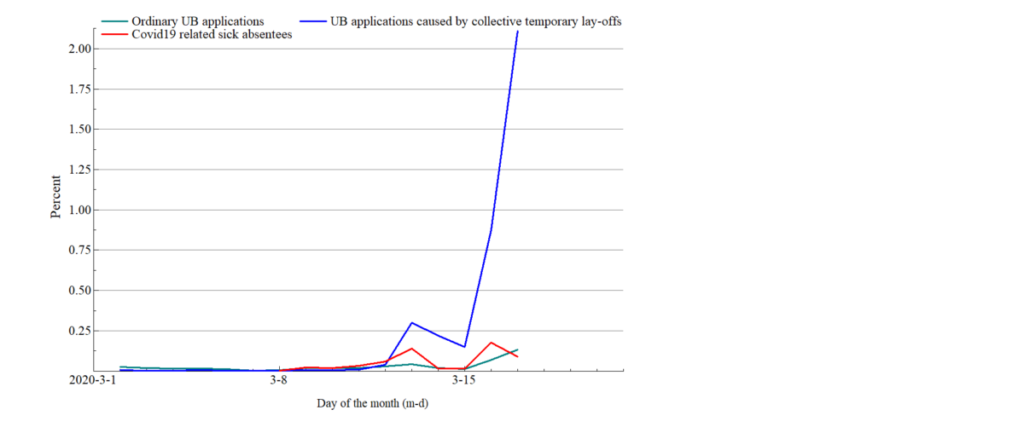
(green line) and new sick absentees due to Covid 19 virus. In percent of labour force (fourth quarter 2019)
Source: NAV and Statistics Norway
Though temporary, most of the new daily UB applications are certain to enter the stock of unemployed workes, which is therefore believed to increase swiftly to very high levels by Norwegian standards.
On the same day, 17 March, the number of new workers being away from work due to Covid 19 (suspected as well as diagnosed after testing) was 0.09 percent of the workforce. Increasing from previous days though.